
Perceivable
Users should be able to understand the content using just one sense, like sight or hearing.
Users should be able to understand the content using just one sense, like sight or hearing.

All webpage elements must be operable by end users. For example, your site should be fully navigable using a keyboard or voice commands for those who don’t use a mouse.

Simply put, users need to understand what’s on the page and how it works.

The website should clearly convey information to all users, including those using assistive technologies, and stay compatible with changing technologies and user needs.
For guidelines on when to use alt/title tags on images, please refere to the image guildelines page.
|
DO |
DON'T |
|---|---|
|
Author links without the extra characters to keep the content clear and concise. EXAMPLE: Read more about McGraw Hill Literacy |
Don't use special characters with links. In this example, the screen reader will read the ">" as "greater than". |
|
Ensure lists are semantically marked up using <ul> or <ol> tags and include an appropriate heading to introduce the content. If needed, consider using a different component. The call to action, card varations (button cards, manual card, article cards) have this built in. EXAMPLE: Discover flexible solutions for any learning environment. |
Do not create list-style content without semantic markup (<ul> or <ol>) or without contextual information. EXAMPLE: |
|
Use the link styling Dark Link or Dark Link Underline on light blue (#DBE5FA) or grey accent 01 (#e5e5e5) backgrounds. Either style will meet a11y requirements. |
Do not use the blue text links on the light blue (#DBE5FA) or grey accent 01 (#e5e5e5) backgrounds. They will not pass the ratio checks. |
Can be added to your bookmarks and are easy and basic accessiblity checks to pages on the site. To add just drap the link in the "Install Link" column to your bookmarks bar. When you are ready to use, just click on the bookmark.
Evaluate web accessibility within your browser using this Chrome extension.
Used under developer tools. Accessibility Insights for Web enables developers to efficiently identify and resolve accessibility issues.
This software provides a report detailing several accessibility guidelines across different compliance levels.
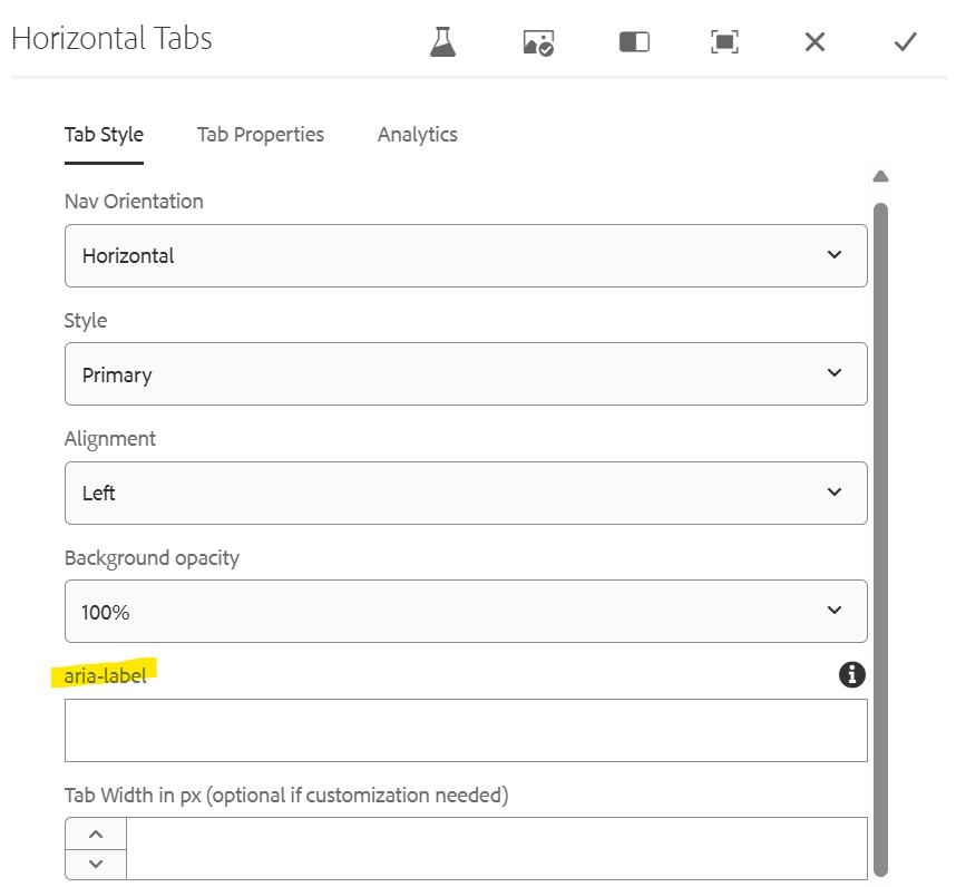
Field: aria-label
The tab component needs an aria-label that will define the group to a user. In some instances, this can be the h2.
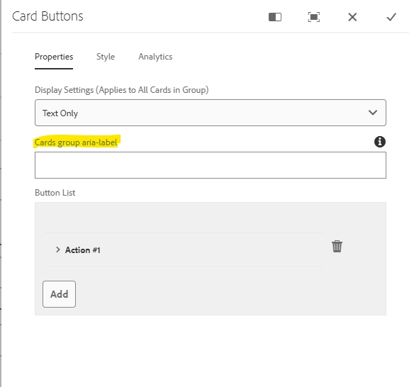
Field: Cards group aria-label
The Card Buttons component needs an aria-label that will define the group to a user. In some instances, this can be the h2.
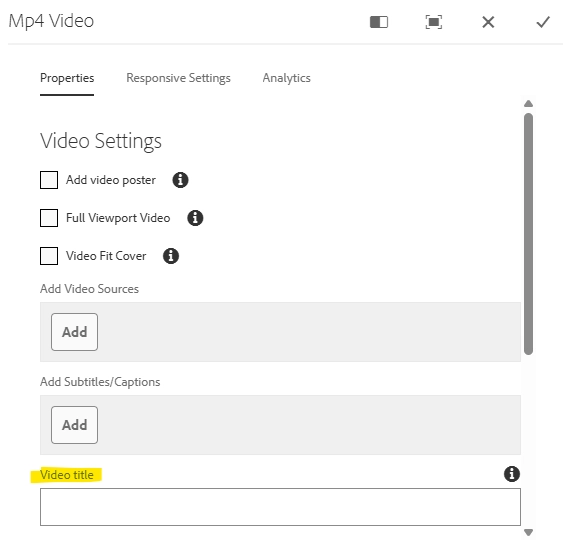
Field: Video title
The .mp4 video component requires a descriptive video title. This is typically something brief, like “Anna’s Story.” It will be visually hidden but available to screen readers.
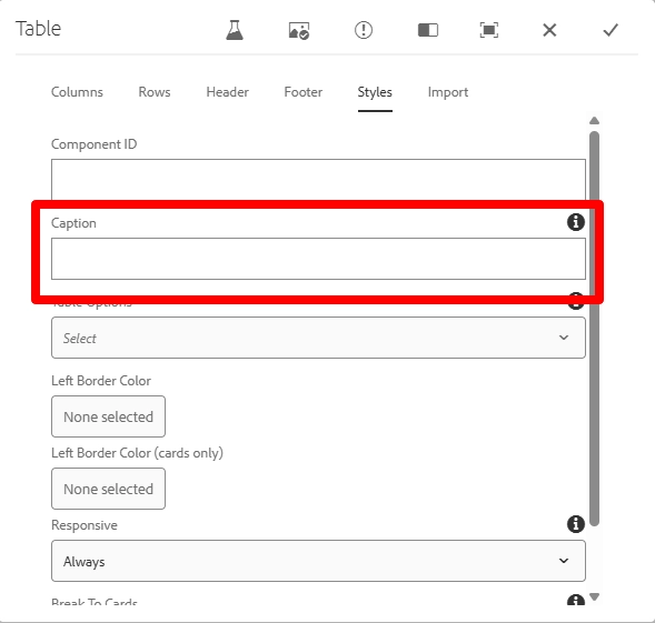
Field: Caption
The table component needs a caption that describes its content in place of a visible title. This caption will be hidden from sighted users but available to screen readers.
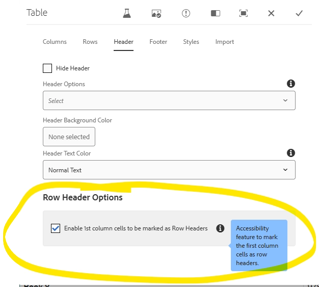
Field: Row Header Options
The table component requires authors to check a box that will mark each row header for the screen reader. This will tell the user that the content in the row is associated with that first column. Pretty much every table will need this unless it is only one column, which is rare. I am working with dev to make this checked by default but for now, authors will have to check it manually.
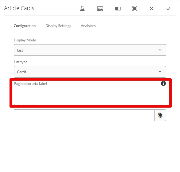
Field: Pagination aria-label
This field provides a description of both the pagination and the group of cards for users. When referencing the page numbers beneath the component, it will automatically add the word ‘pagination’ to the text (i.e. blog articles pagination)
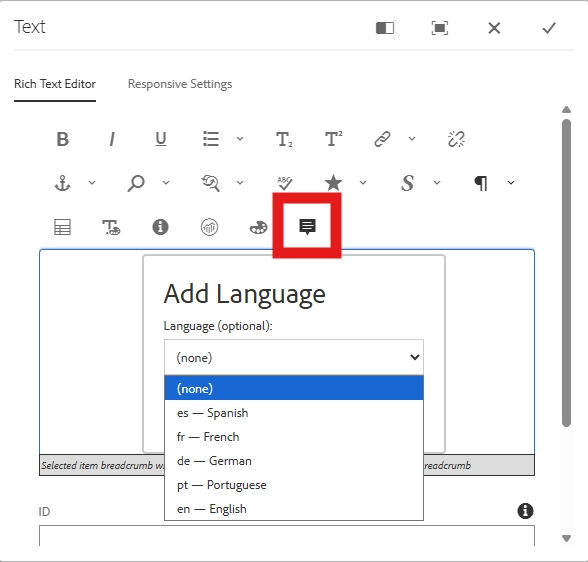
Select add language icon (quote box)
This option allows authors to identify text written in a foreign language. Screen readers normally use the default language (e.g., English), but this flag ensures proper pronunciation and correct language recognition.
Updated call to action from a text link to a button
The promo card previously had a text link for the CTA. This was not accessibile against all background colors so UX has agreed to change this to a primary button outline.
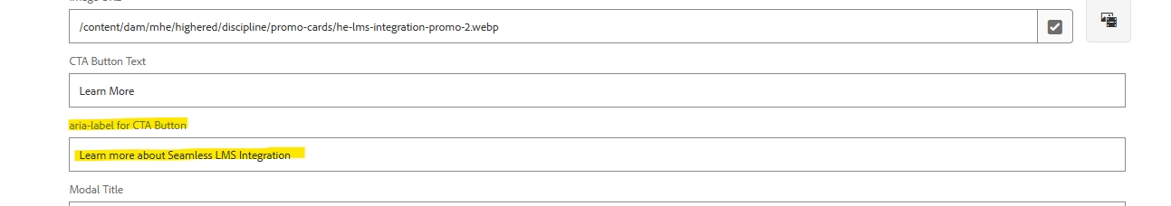
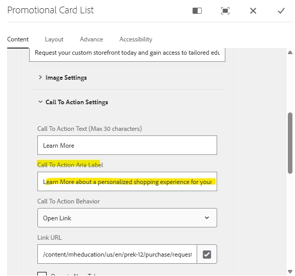
Field: Added aria-label to promo card component and to the content fragments that feed them.
When building a promo card with a content fragment, you'll need to enter the aria-label in the for the call to action in the content fragment itself.
When building out a promo card manually, you'll add is on the actual card under the CTA settings dropdown.